

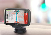
TomTom Navigation
I led a team of designers to define the visual language for TomTom’s next-generation navigation platform, used by millions of drivers, supporting the shift from a consumer product to an enterprise solution for automotive partners.
The challenge was to create a navigation experience that performs reliably in real-world driving conditions, while adapting to different screen sizes, hardware environments, and automotive brand requirements. This meant designing for glanceable interaction, balancing real-time data with cognitive load, and ensuring consistency across mobile and in-vehicle systems.
MY CONTRIBUTION
I led the development of a scalable visual system spanning mobile devices, embedded automotive systems, and multiple screen sizes. I defined core design principles, guided the team, and worked closely with engineering to ensure consistent implementation across platforms.
FOUNDATION
The visual design was grounded in a few key principles
Based on our Brand Values
INVENTIVE
TANGIBLE
ESSENTIAL
PERSONAL
HUMANE
Rooted in Dutch Design
BOLD
QUIRKY
HUMOROUS
WARM
HUMANIST
Inspired by Wayfinding
EXTRA-CLEAR
EFFICIENT
DIGESTIBLE
STRUCTURED
FUNCTIONAL
Highlights of the Visual System
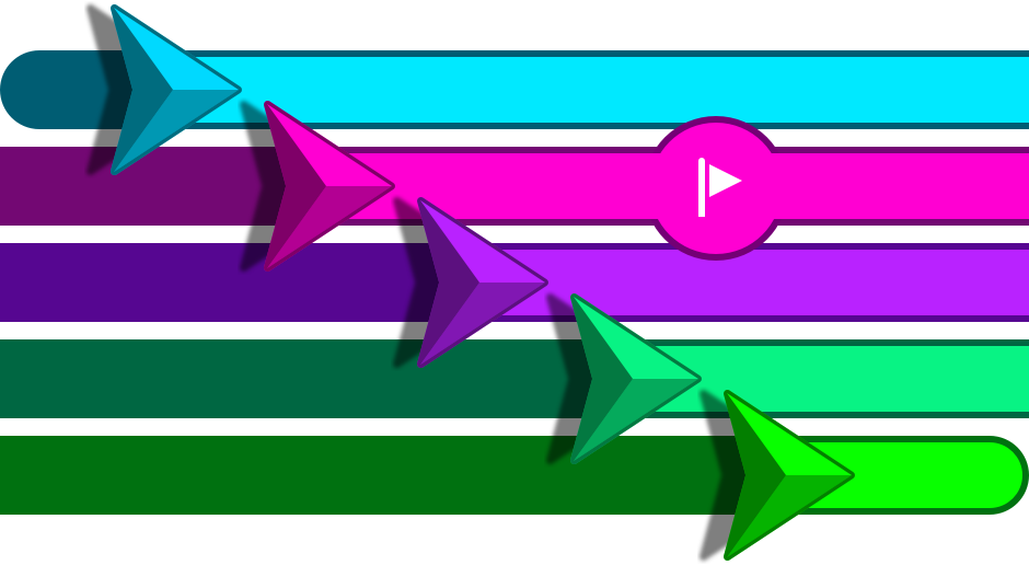
ENABLING BRAND ALIGNMENT AND PERSONALIZATION AT SCALE
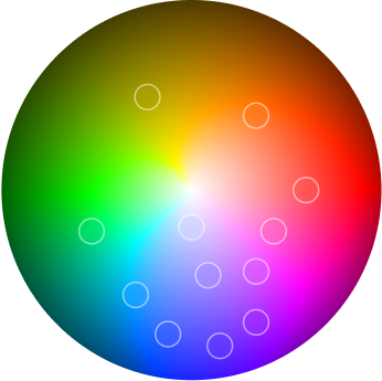
To support both end-users and automotive partners, I introduced a flexible accent color system that allows the interface to be customized while maintaining consistency and clarity. These accent colors are applied to key elements such as the vehicle indicator, route line, and interaction states.
For consumers, this adds a sense of personal ownership and emotional connection. For automotive clients, it enables seamless alignment with their infotainment color strategy and brand identity without requiring structural changes to the UI.
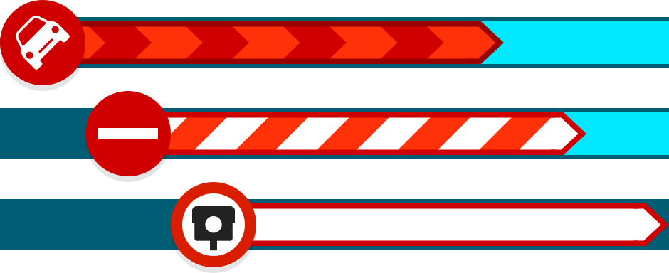
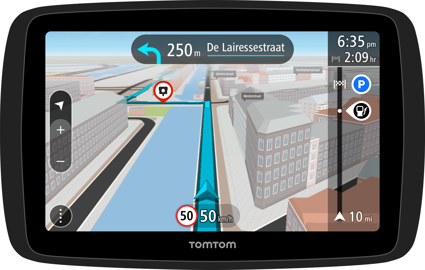
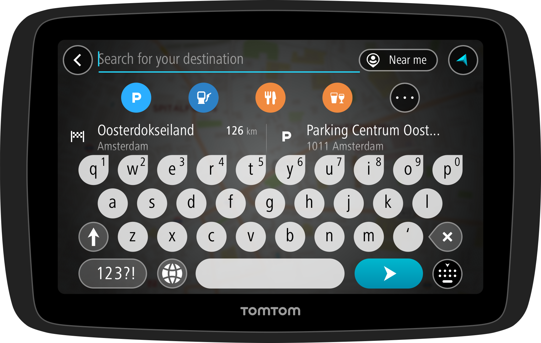
SUPPORTING REAL-TIME DECISION MAKING
I introduced a color-coded alert system to highlight hazards, traffic disruptions, and speed camera alerts. Using a clear red-based spectrum, it enables drivers to recognize urgency at a glance, reducing cognitive load and supporting faster, safer decisions.
Improving glanceability and interaction in driving conditions
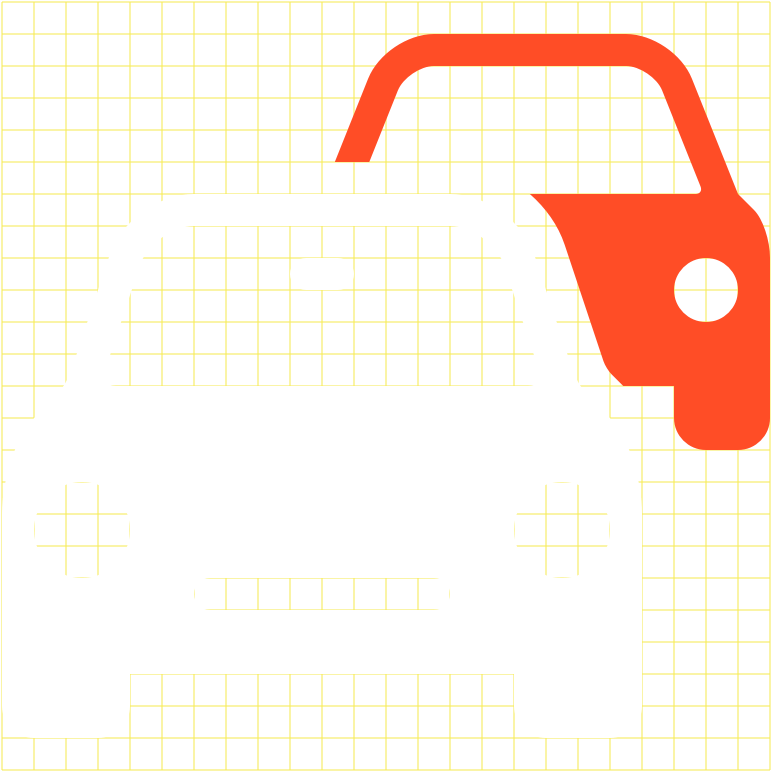
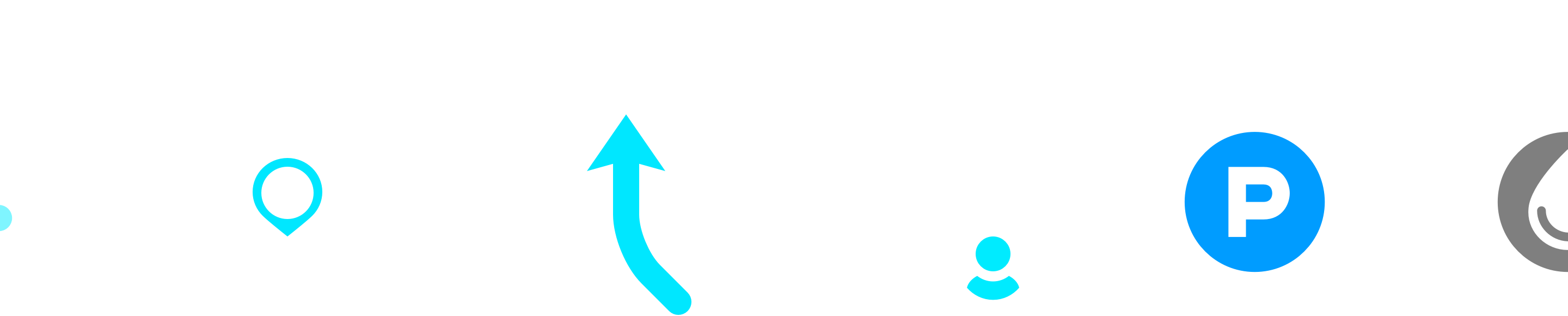
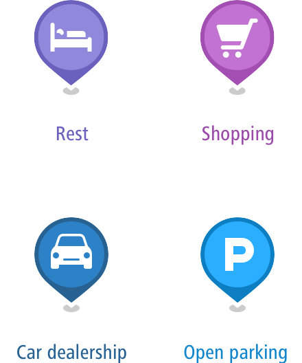
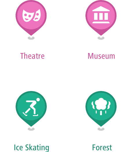
I designed a scalable icon system optimized for quick recognition and ease of interaction while driving. Icons were intentionally simplified and enlarged to support glanceable understanding and provide generous touch targets, reducing cognitive load and interaction friction in high-attention contexts.
The system was built to remain sharp and consistent across a wide range of screen sizes and resolutions, ensuring usability and recognizability across both mobile devices and in-vehicle displays.

Map as the core experience
I designed a light, neutral map palette as a foundation for critical overlays such as routes, traffic, and alerts, improving visual hierarchy and real-time clarity.
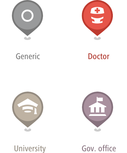
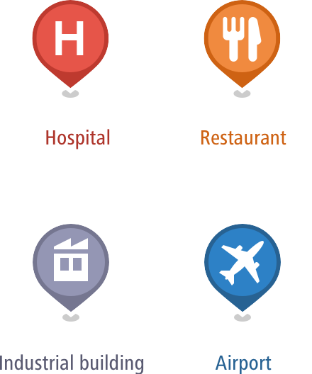
IMPROVING DISCOVERABILITY OF POINTS OF INTEREST
I introduced a color-coded POI system to help users quickly distinguish between categories such as food, fuel, and services, making nearby options easier to explore at a glance.
CREATING FAMILIAR AND RECOGNIZABLE LANDMARKS
I developed a muted color palette for 3D buildings based on real-world architectural materials. This creates a sense of familiarity and helps users recognize their surroundings, while keeping the focus on navigation guidance.
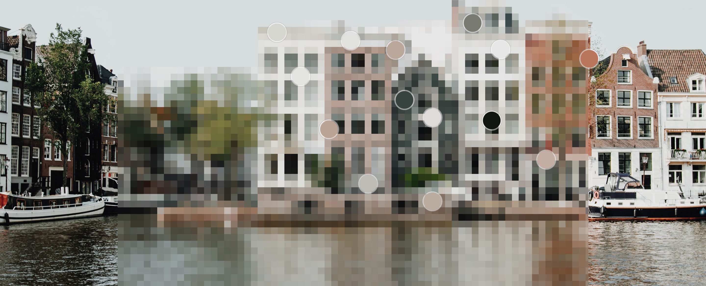
ENHANCING SPATIAL AWARENESS THROUGH TEXTURE
I contributed to detailed 3D map textures, including layered window treatments, to add subtle depth and realism. This improves spatial understanding without competing with critical navigation information.

Original

Refinement
Depth
Shade/Light
Color variation
Texture
Less detail and lighter color on lower zoomlevels or further distance.


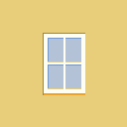
A muntin is a strip of wood or metal separating and holding panes of glass in a window. Muntins can be found in doors, windows and furniture, typically in western styles of architecture. In the U.S., the thickness of window muntins has varied historically, ranging from very slim muntins in 19th century Greek revival buildings to thick muntins in 17th and early 18th century buildings.
Rectangular Windows with Dividers

Glass Curtain Wall

Windows with Large Balconies

Modern Windows without Dividers

Arched Rectangular Windows with Dividers

Church Windows
Bringing it together
The UI system brings color, iconography, texture, and layout into a cohesive visual language, optimized for clarity, performance, and consistency across platforms.
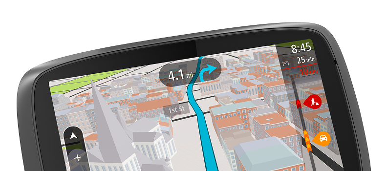
I designed the core layout for both guidance and overview states, framing the map with persistent elements such as route information, traffic alerts, and status indicators. The layout ensures key information remains accessible without overwhelming the driving experience.
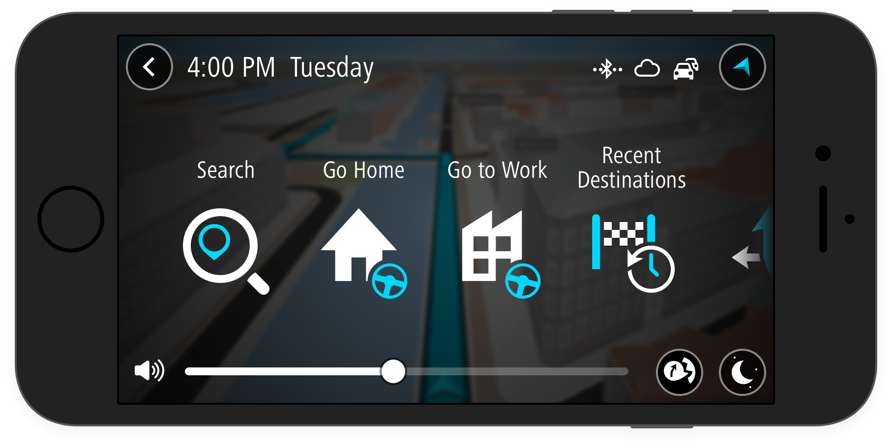
DESIGNED FOR ANY DISPLAY
The interface was built as a screen-agnostic system, scaling seamlessly across mobile devices, embedded dashboards, and dedicated navigation units. This ensures a consistent and reliable experience across different hardware, screen sizes, and automotive environments.
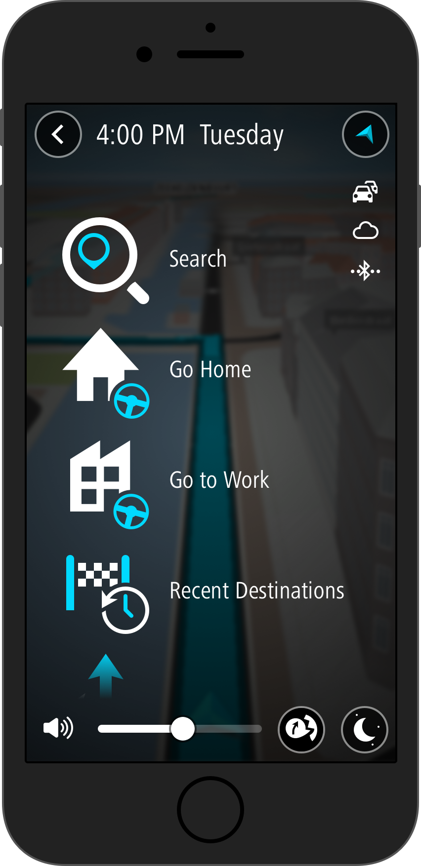
I introduced the circle as a recurring motif across controls and UI states. This simple, universal shape adds visual coherence, reinforces focus, and creates a distinct and approachable design identity.
Outcomes & Impact
The result was a scalable navigation platform that enabled TomTom to deliver a consistent user experience across mobile devices and in-vehicle systems. The visual system balanced clarity and expressiveness, supporting reliable use in real-world driving conditions while allowing adaptation to different automotive brand identities.
My contribution established a clear and extensible design foundation, improving consistency across products and enabling teams to implement and evolve the experience efficiently across platforms and partners.