
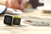


TomTom Runner
GPS Watch
The TomTom Runner GPS Watch was designed for runners training in tough outdoor conditions, with a focus on clarity, durability, and ease of use. My role as Lead Product Designer covered the full digital experience — from the on-watch UI to a connected mobile and web platform.
DESIGN PHILOSOPHY
Every design decision reflected our core values
Striving for Simplicity
CLEAN
PRECISE
INTUITIVE
ACCESSIBLE
INFORMATIVE
Eliciting Emotions
IMMERSIVE
PLAYFUL
MEANINGFUL
PERSONAL
FAMILIAR
Driven by Sports
INSPIRING
VIVID
ENERGETIC
DYNAMIC
STRONG
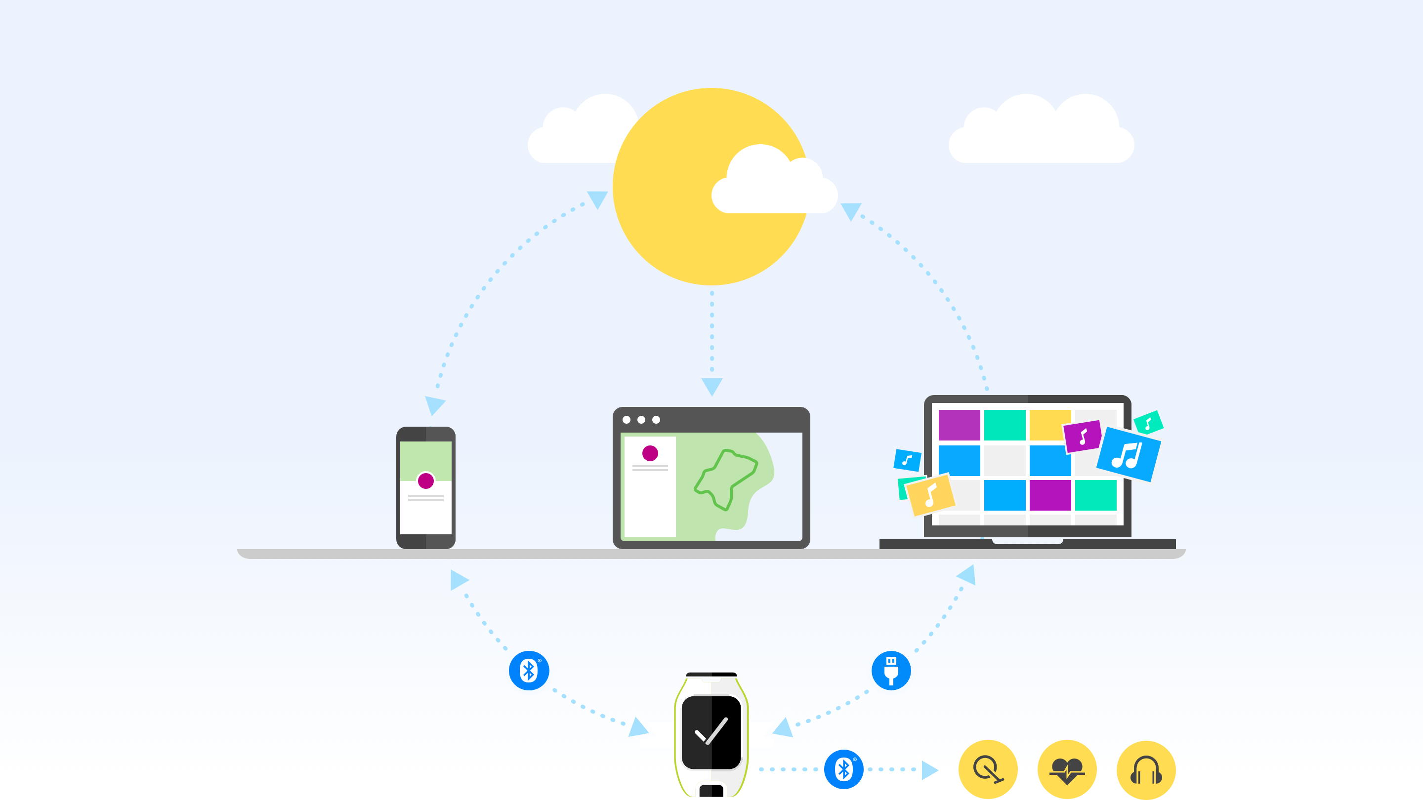
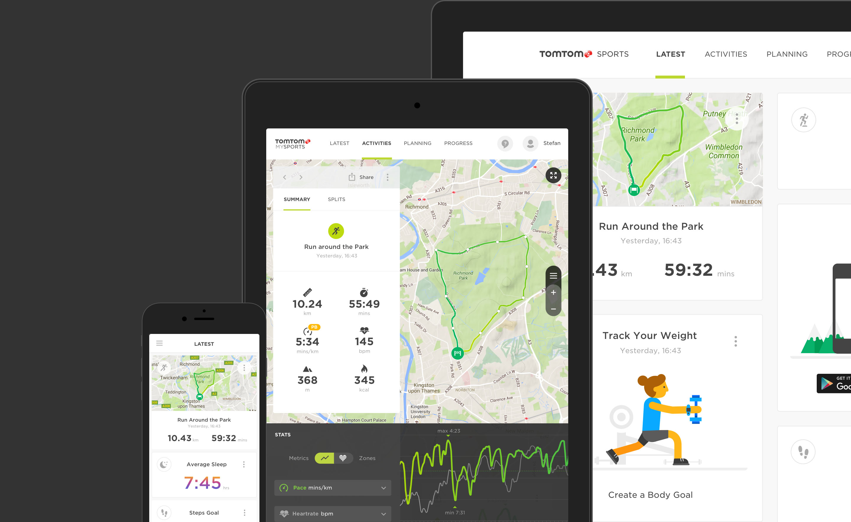
Leading visual design across a connected ecosystem
As Lead Visual Designer, I was responsible for defining a cohesive and engaging visual language across the TomTom Runner digital ecosystem — including the GPS watch interface, mobile app, and web platform. My focus was on creating a clean, intuitive experience that supported runners in the moment and offered meaningful insights afterward. From typography and color strategy to iconography and layout, I ensured consistency and clarity across all touchpoints.
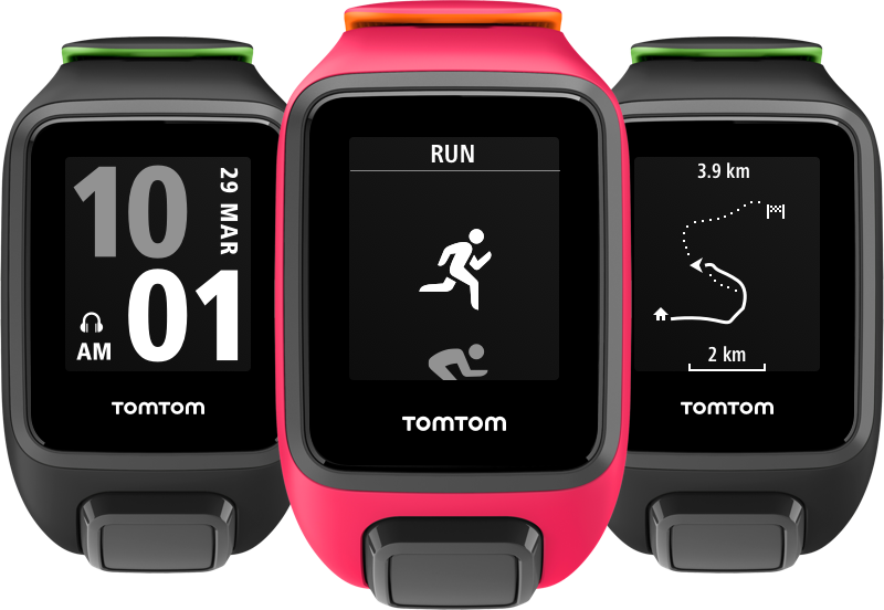
I designed the watch interface to be clean, intuitive, and distraction-free, using bold typography for fast readability of key metrics during runs. A set of rich, easily recognizable icons guided users through the interface, while simple wayfinding cues helped runners stay oriented and on track mid-activity — all optimized for effortless navigation on the go.
Creating an inviting first impression
To draw users into the experience, the mobile app opens with clean white backgrounds accented by bold, vibrant colors. These tones are used in illustrations, empty states, and highlights, setting a playful and emotionally engaging tone that makes the interface feel welcoming and active from the start.
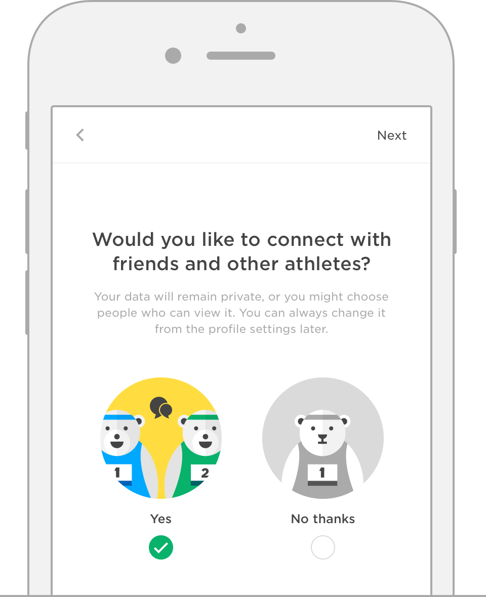
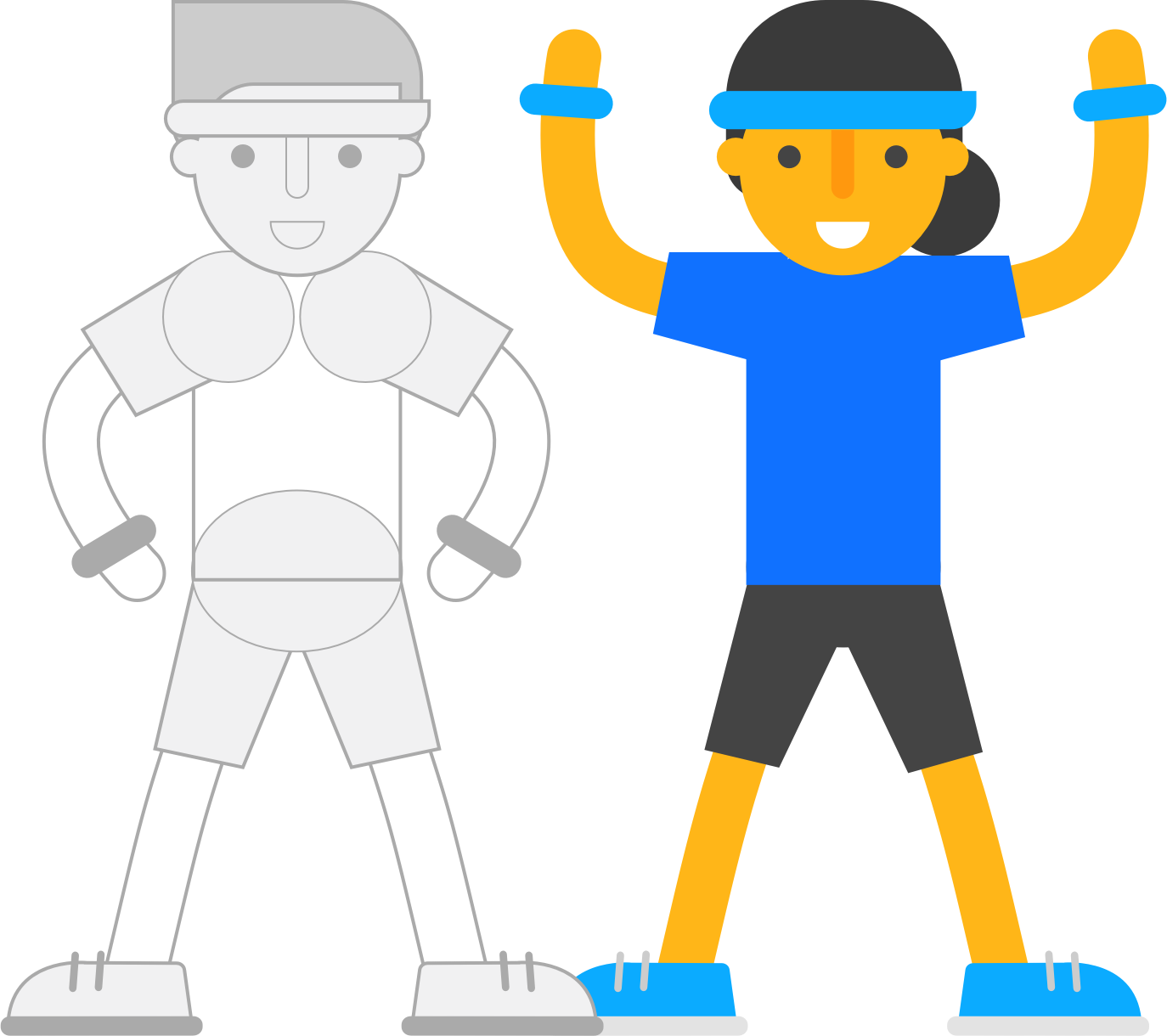
ILLUSTRATIONS WITH PURPOSE
Illustrations were designed to educate, assist, and motivate. They supported onboarding while keeping the experience light and engaging. As part of TomTom’s Sports DNA, they reflected energy, passion, and approachability.
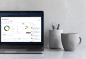
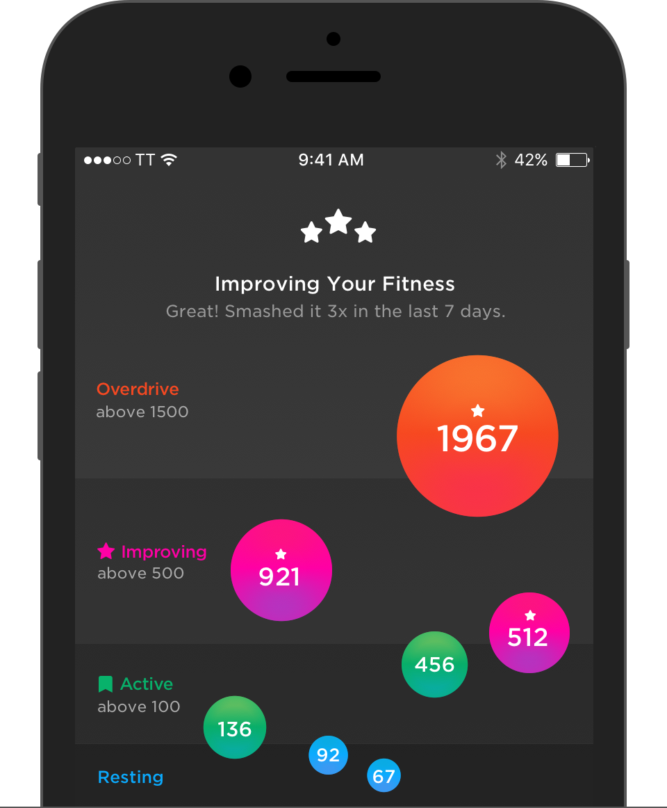
Data analysis
At a deeper level, users could analyse their performance data in a focused, meaningful way. We used select vibrant colors on dark backgrounds to maximize contrast and readability.
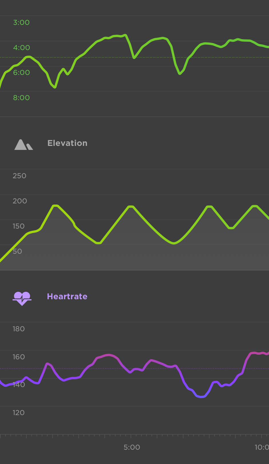
Layouts were designed edge-to-edge to take full advantage of screen real estate, creating a sense of immersion while keeping attention on key metrics.
VISUAL LANGUAGE THAT MOVES WITH YOU
Custom activity icons reinforced visual energy and ease of use, forming part of a cohesive visual language built around emotion, clarity, and motivation.
The result was a product that felt immersive, personal, and dynamic. It gave users tools to track progress, a platform to relive experiences, a way to understand performance, and a reason to celebrate achievements.